Lakritsrevolutionen
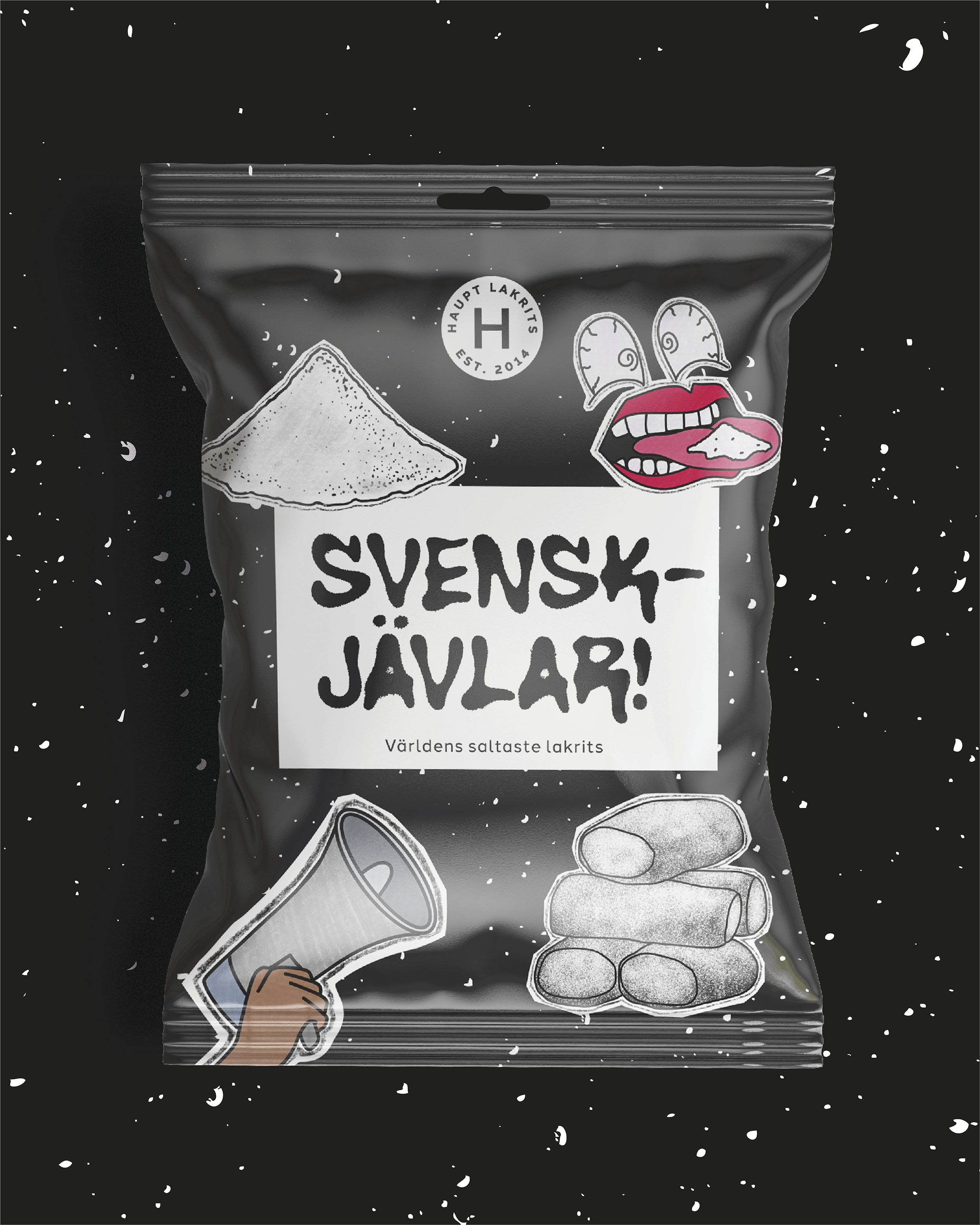
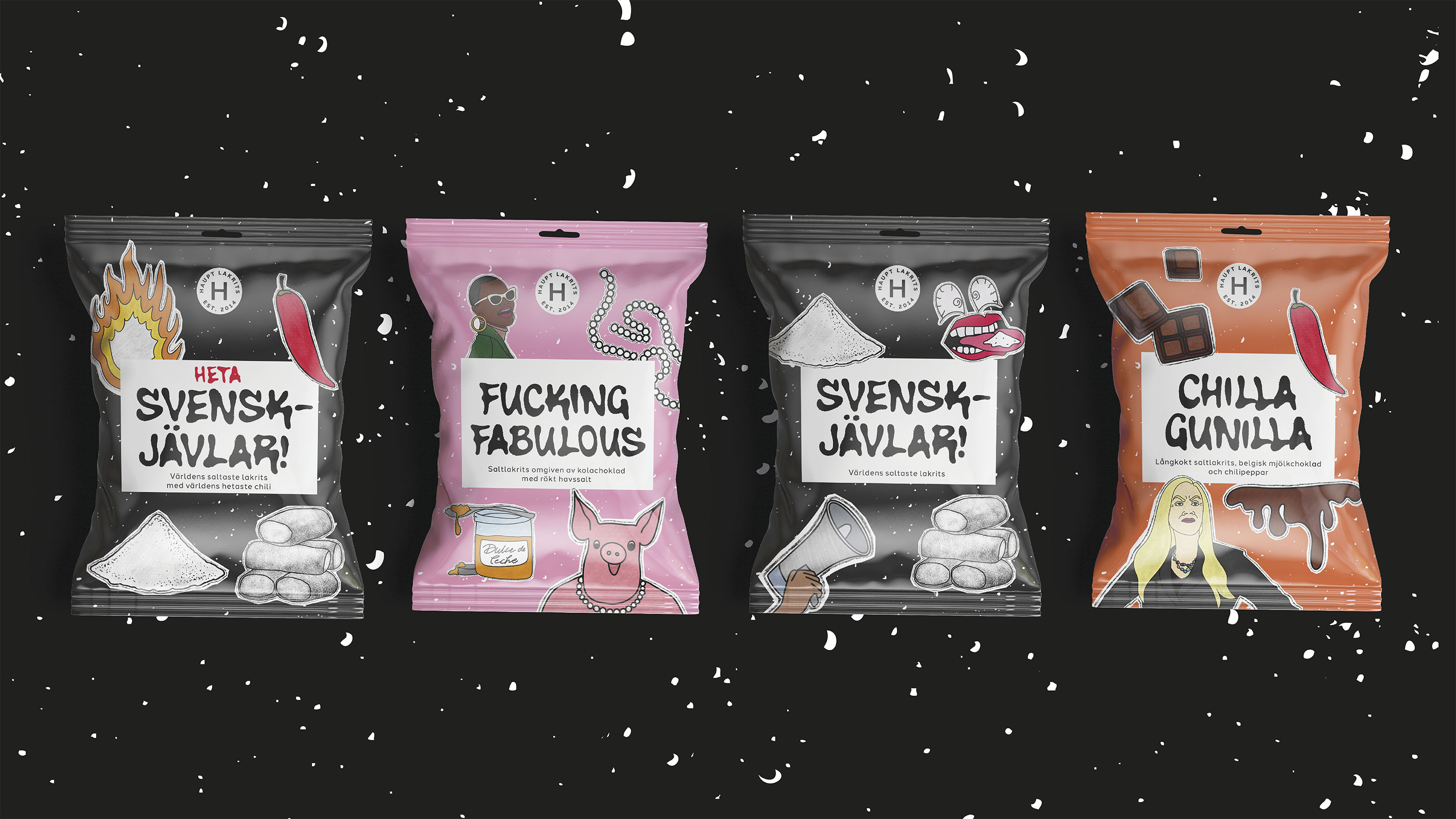
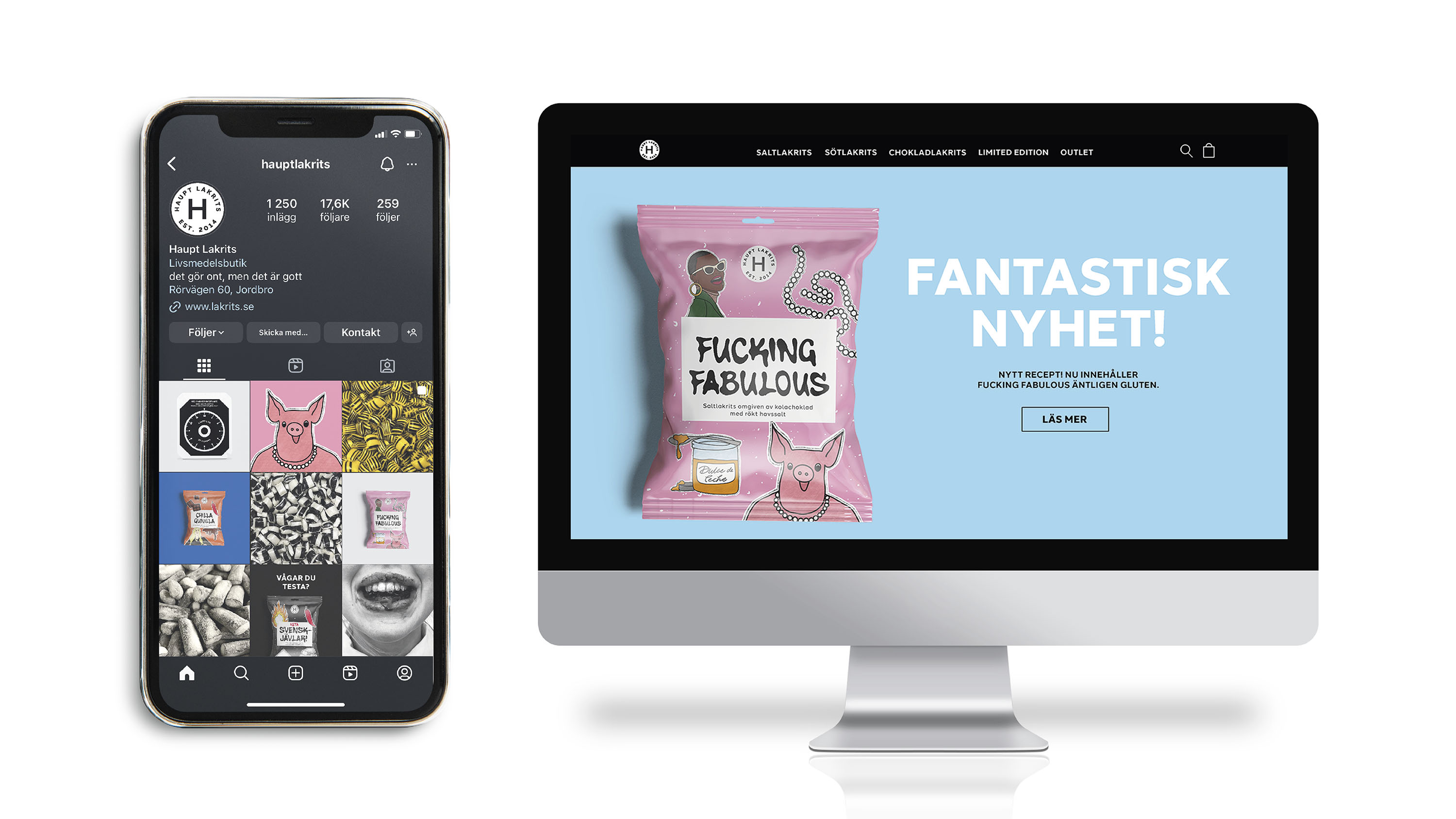
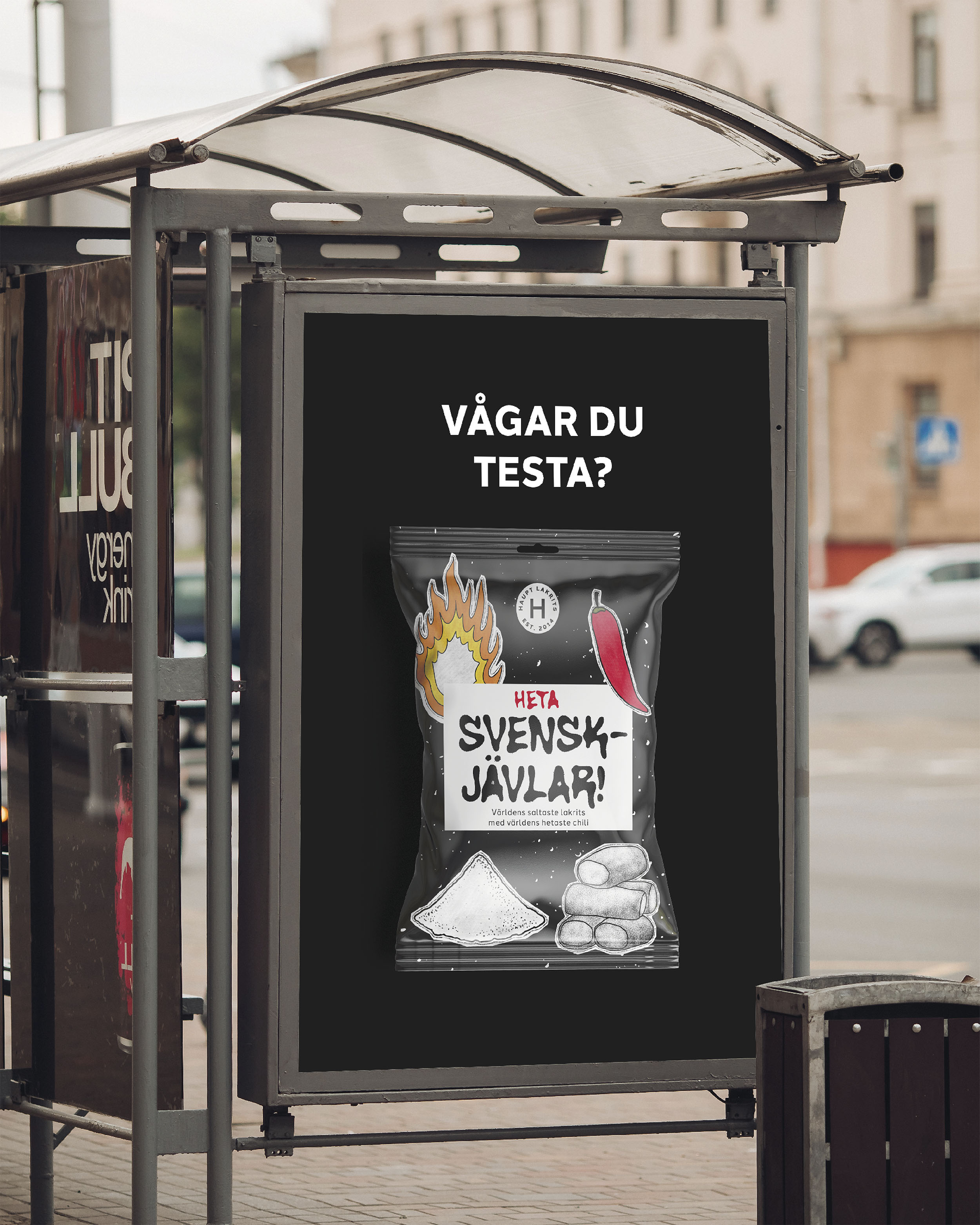
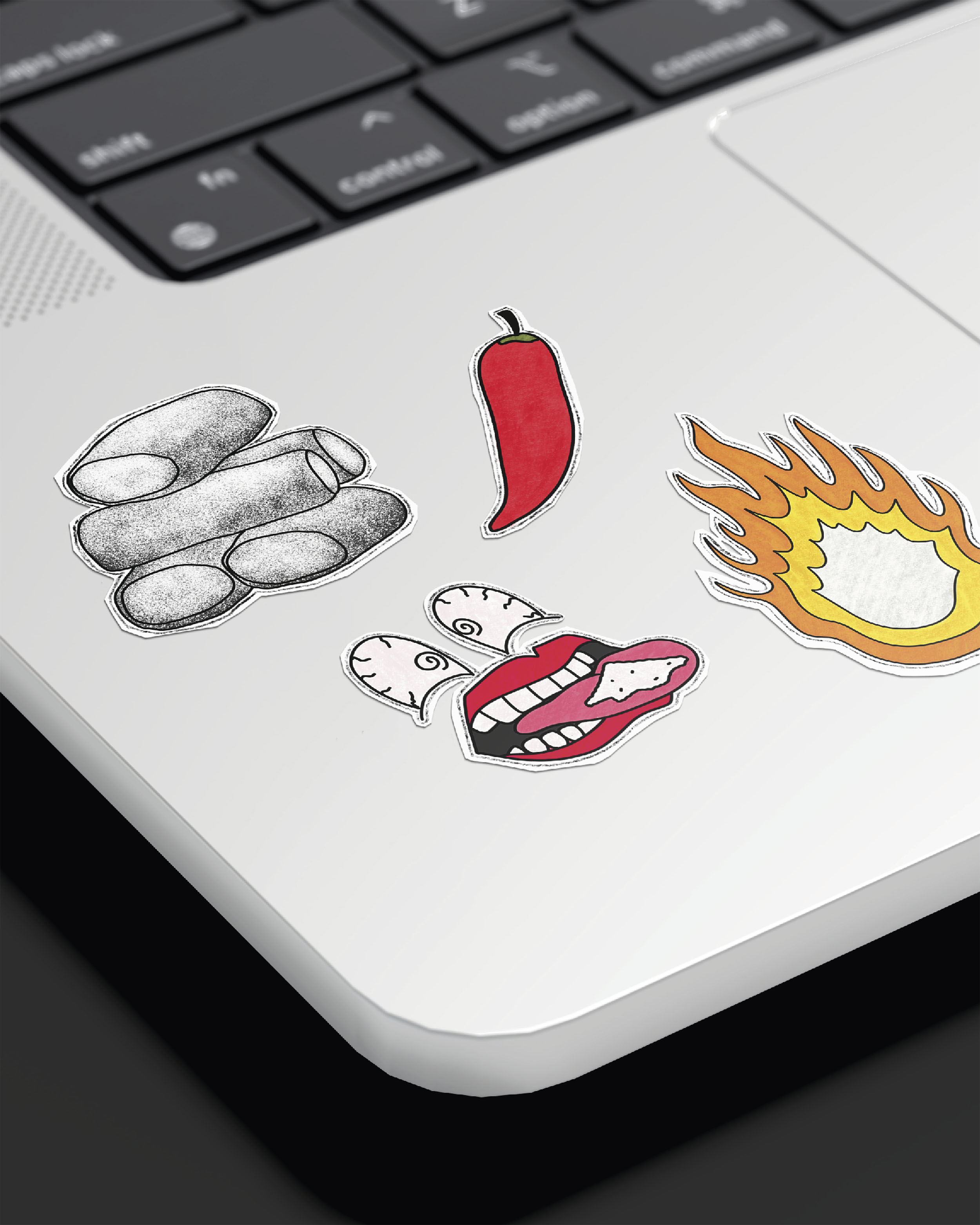
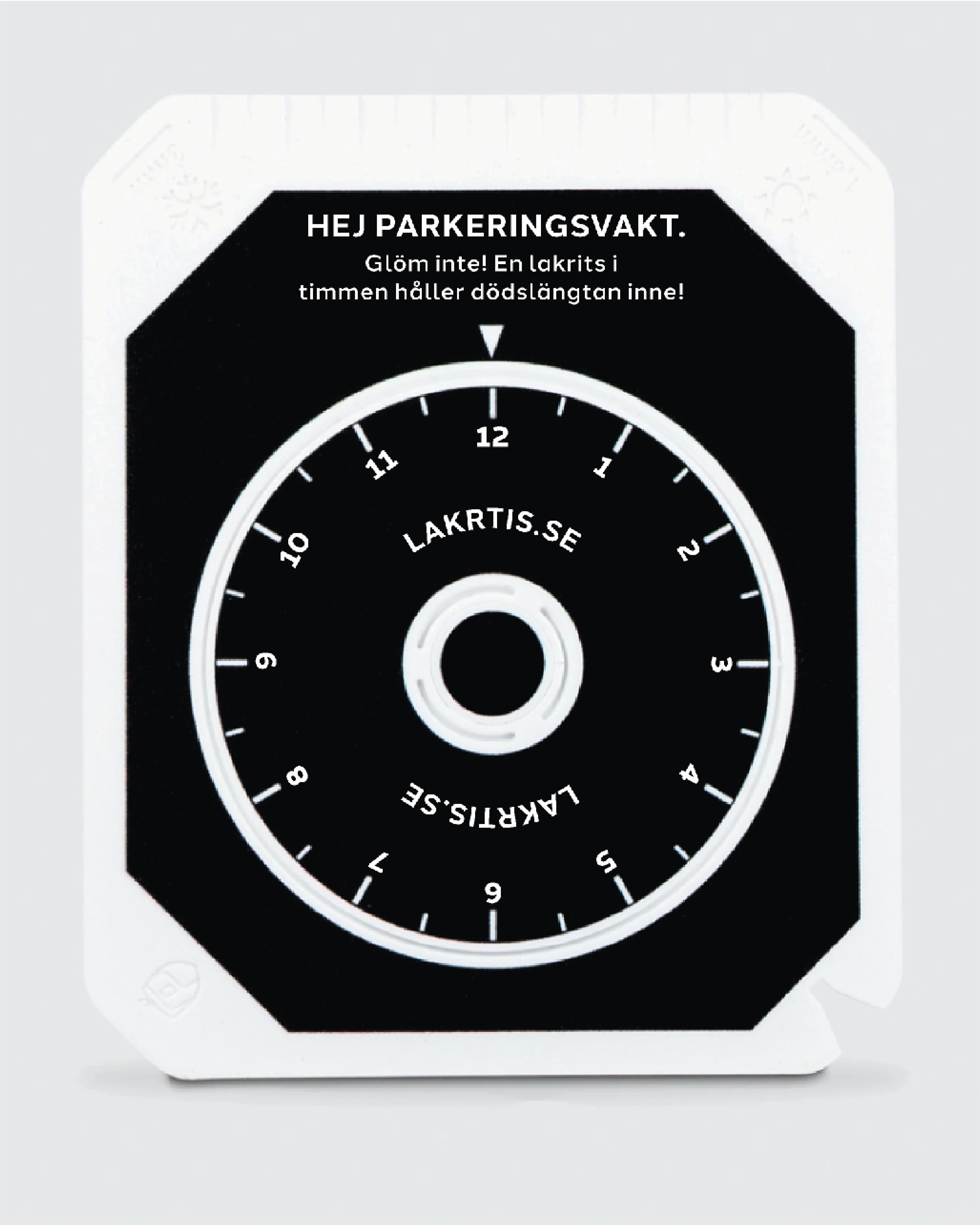
My design project revolves around the revitalization of the renowned Swedish brand, Haupt Lakrits. In the past, they have been struggling with a complex graphic representation, leading to what can be described as an "identity crisis" in the brand's narrative. The main way liquorice is sold in large containers has unintentionally made it seem more expensive, possibly pushing away some of its customers. The original packaging embraced principles of anti-design, avoiding conventional polish for a raw, unrefined aesthetic. However, this rugged charm contrasts with the brand's gift packaging, which exudes a carefully crafted playfulness. Haupt Lakrits prides itself on a slightly weathered, imperfect appeal, shunning pristine perfection. With all of this in mind, the aim of this project is to tackle these challenges head-on by orchestrating a comprehensive rebranding strategy that breathes new life into Haupt Lakrits' visual persona. One of the main goals is to create a unified and meaningful visual style that truly represents the brand's essence. By giving the packaging a unique and consistent look, the aim is to build a stronger bond with customers while also making the brand more memorable and recognizable in the market. The goal is to draw consumers in, sparking their interest and attachment to the brand. By focusing on making the product accessible and affordable, Haupt Lakrits aims to strengthen its presence as a go-to choice for consumers, resonating with them both visually and practically.